Making Mappings
Mapping Charts
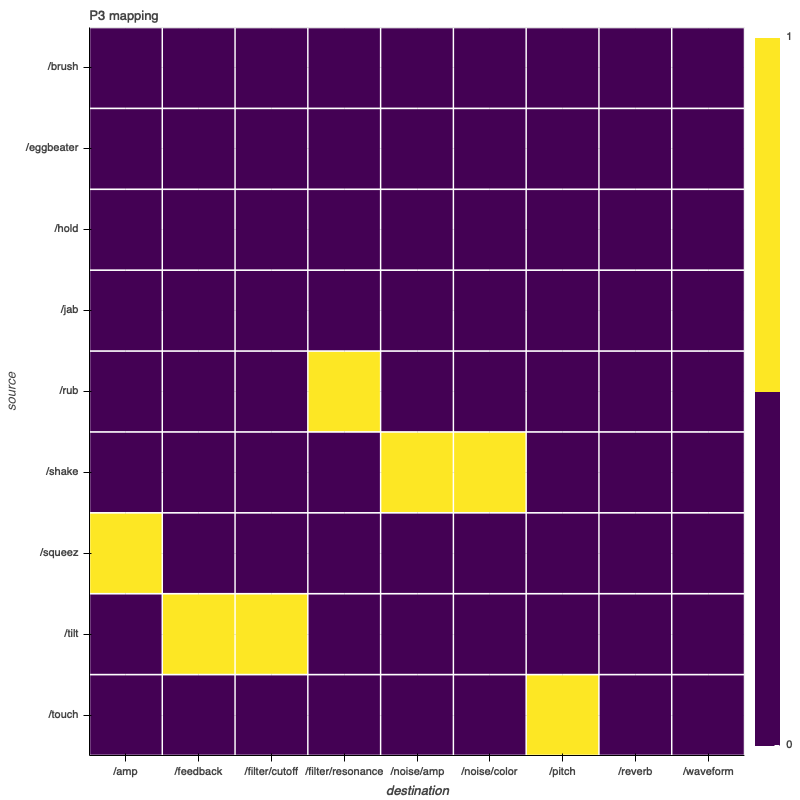
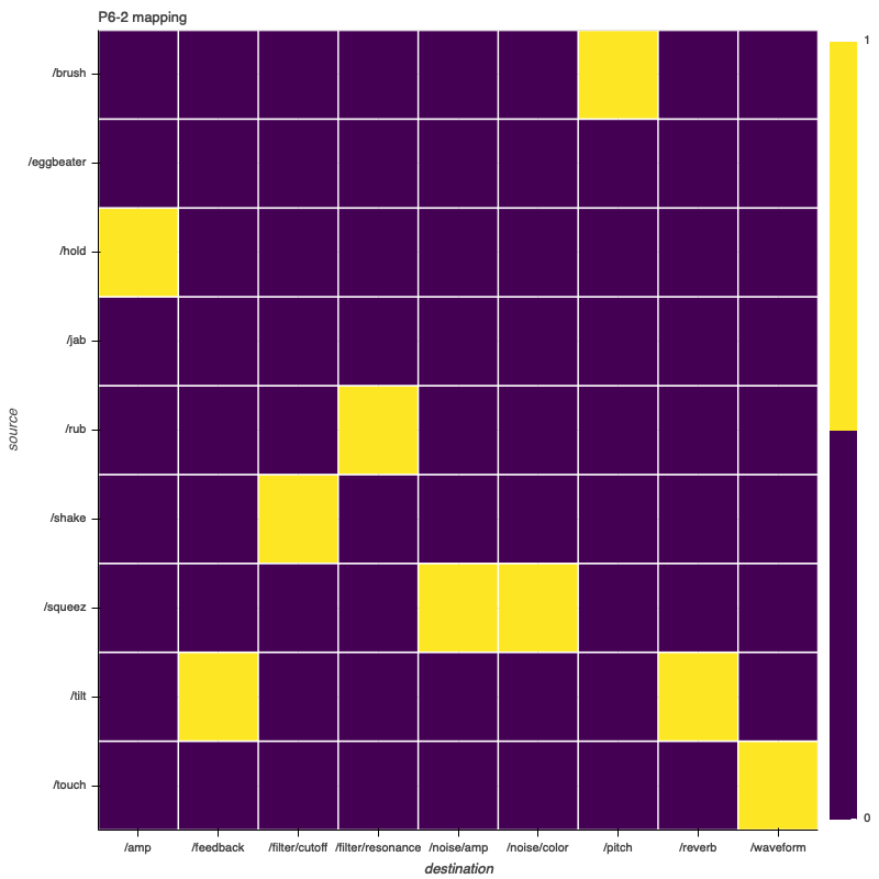
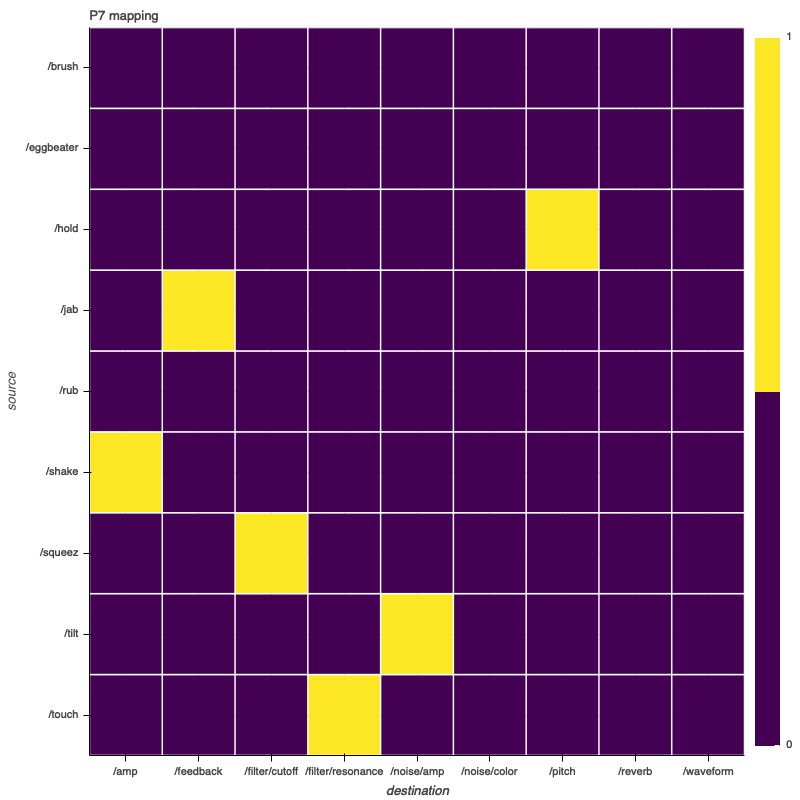
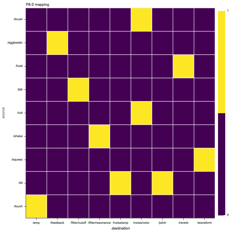
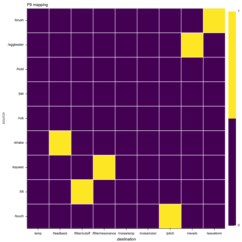
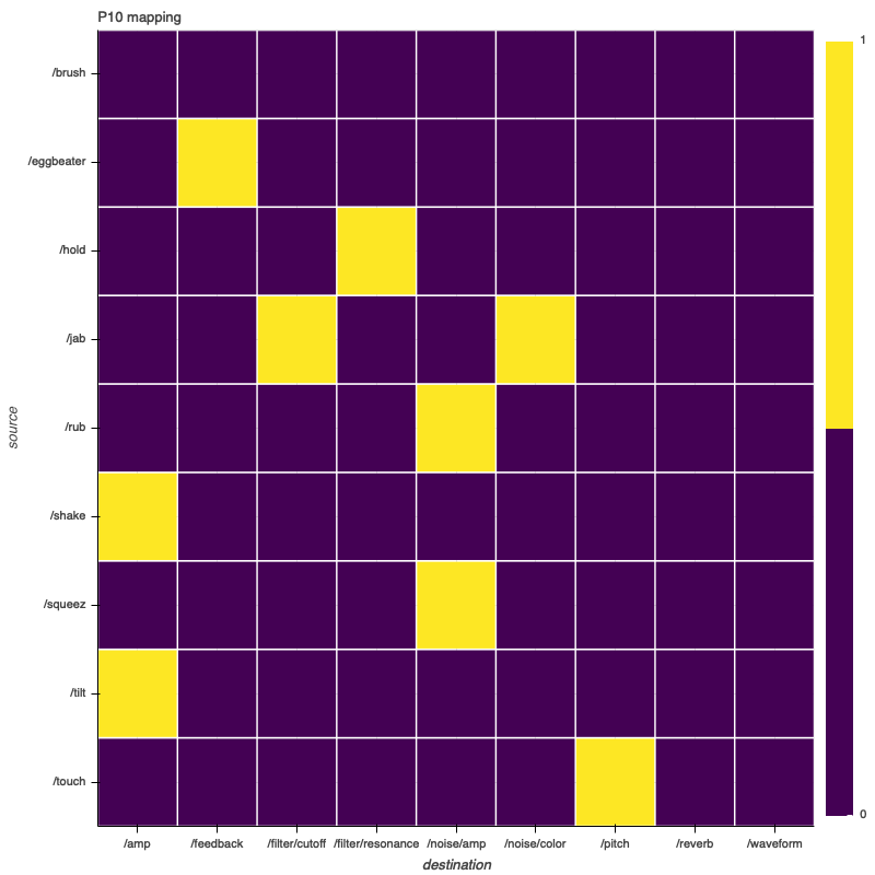
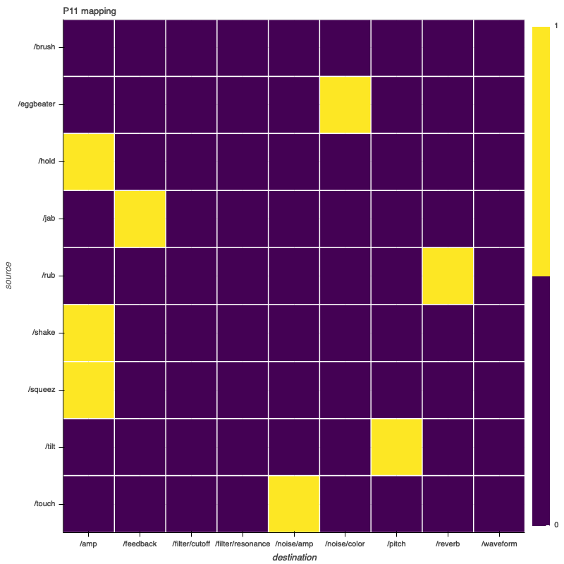
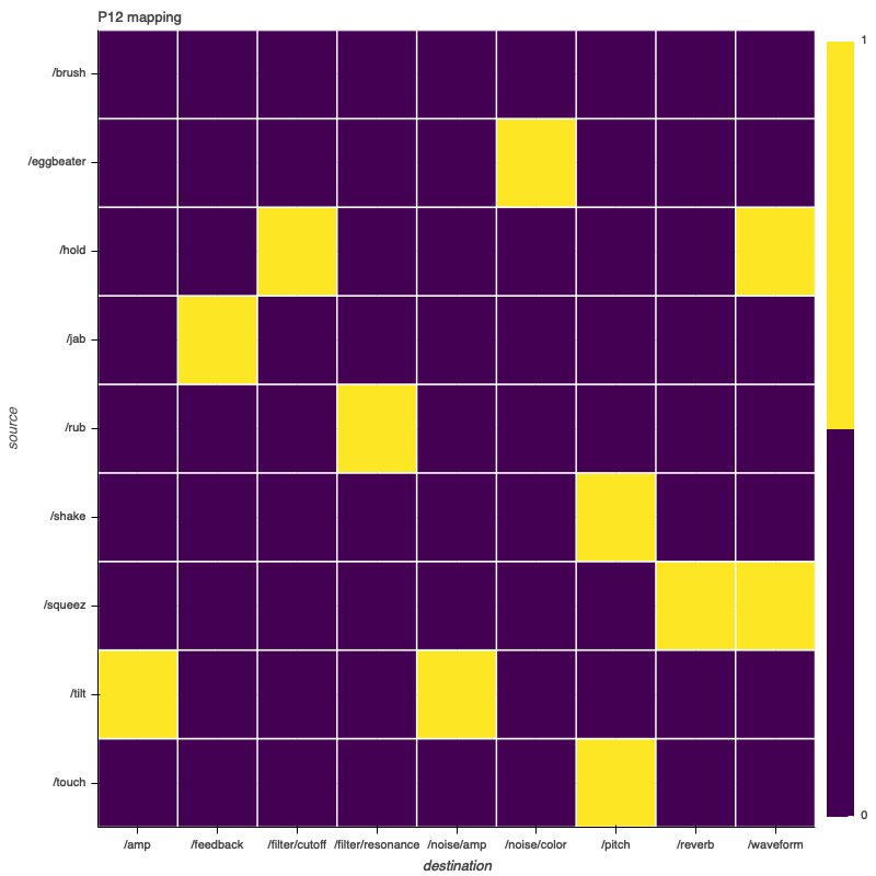
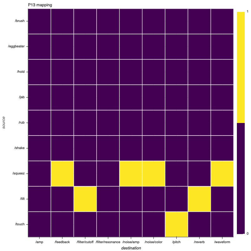
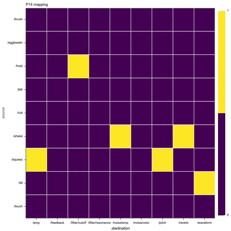
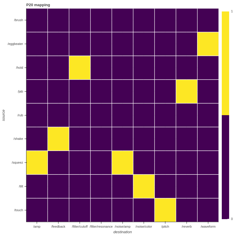
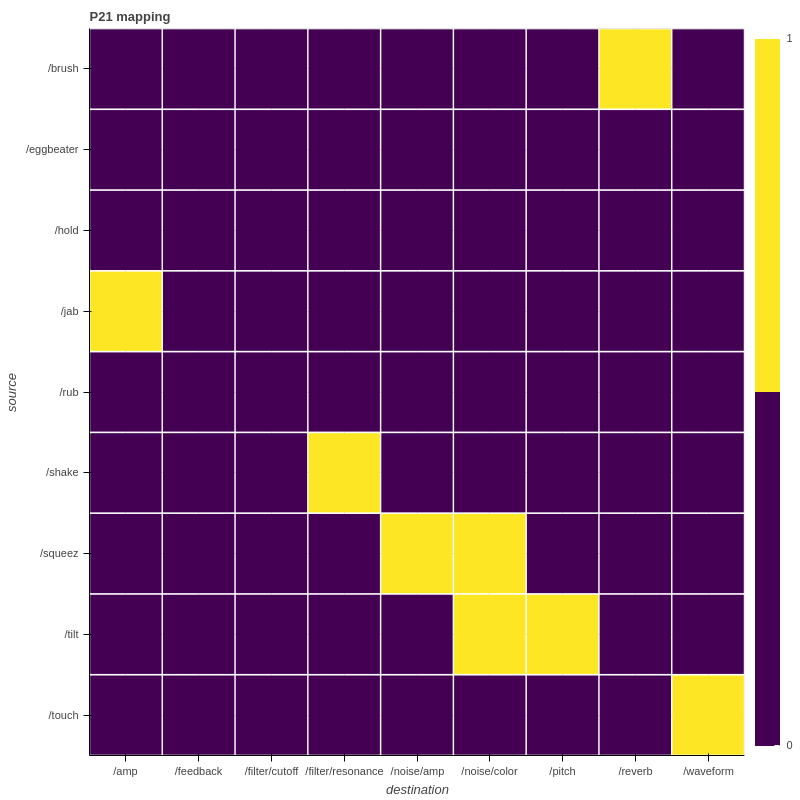
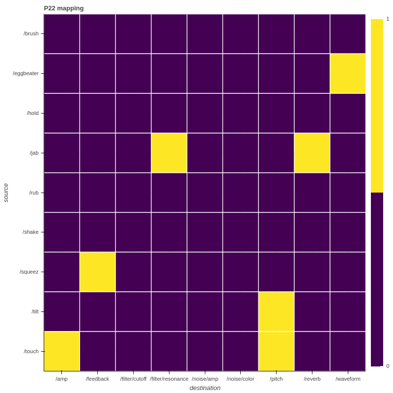
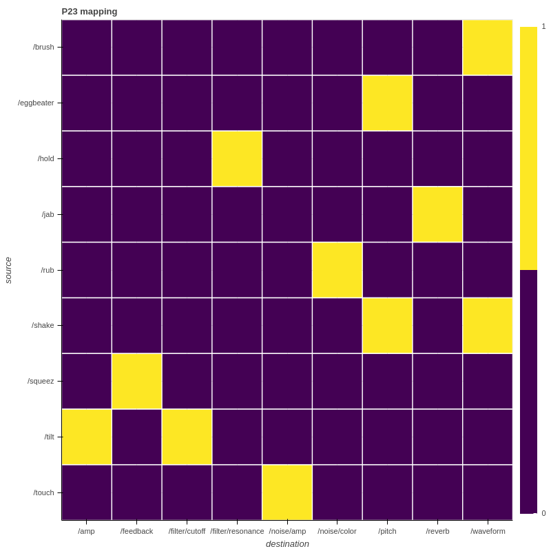
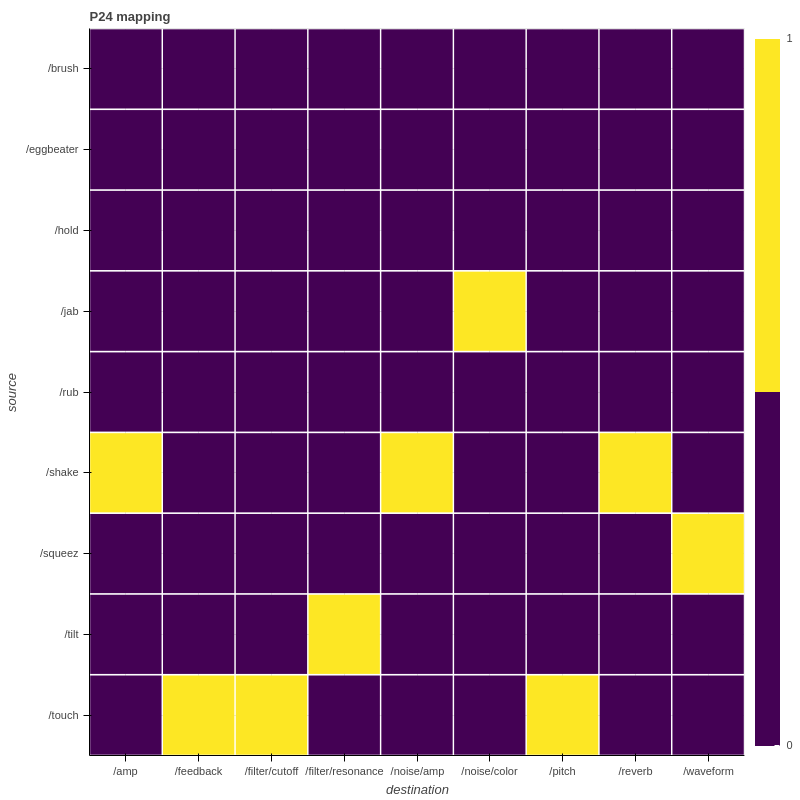
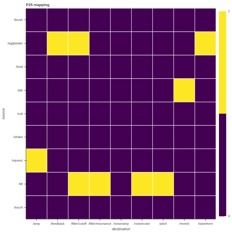
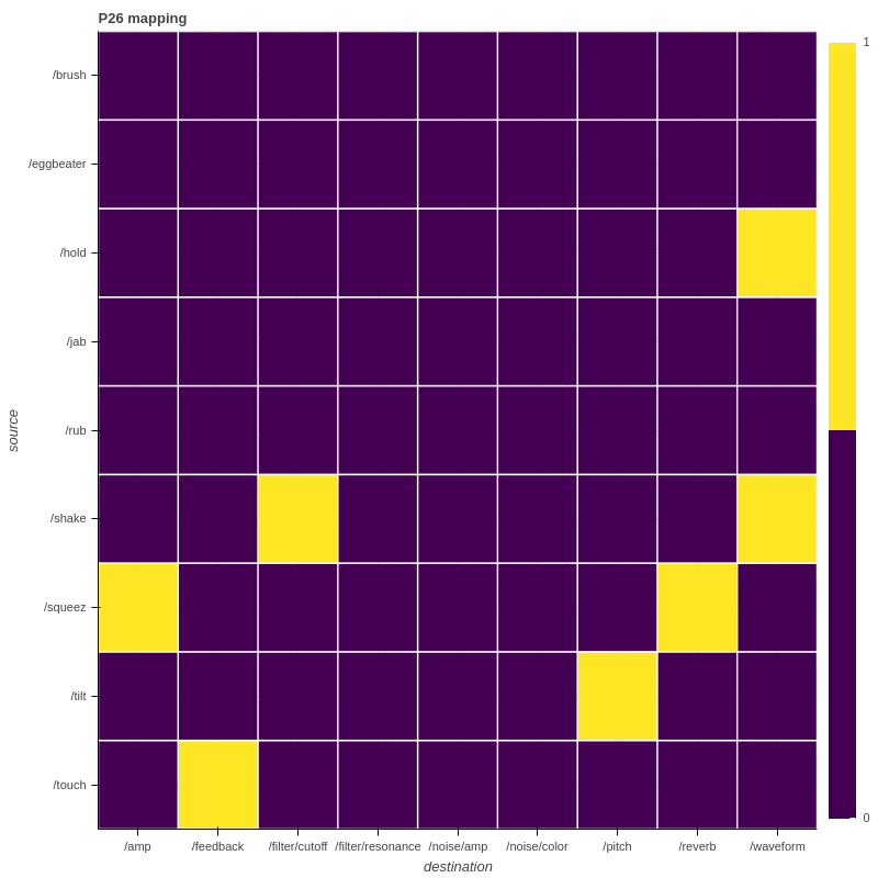
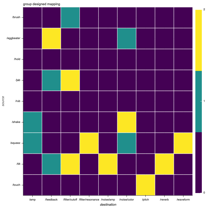
Each participant in the study designed a mapping from the T-Stick to a generic subtractive synthesizer. On this page, these mappings can be viewed in a graphical representation. In general, the charts show the associations betweens the T-Stick signals (along the y-axis) to the synthesizer parameters (along the x-axis), so that each possible association is represented by one of the cells in a grid. If a cell is highlighted, this indicates that the given association was used in the participant's final mapping design.
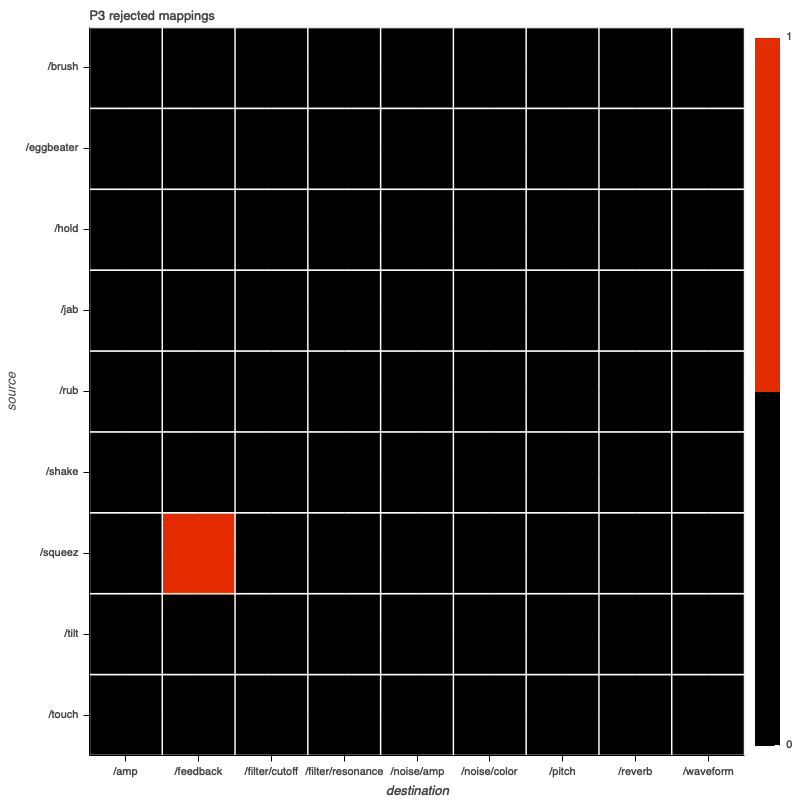
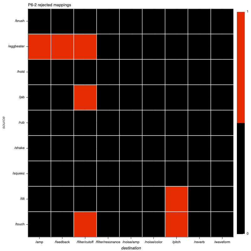
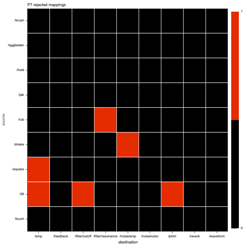
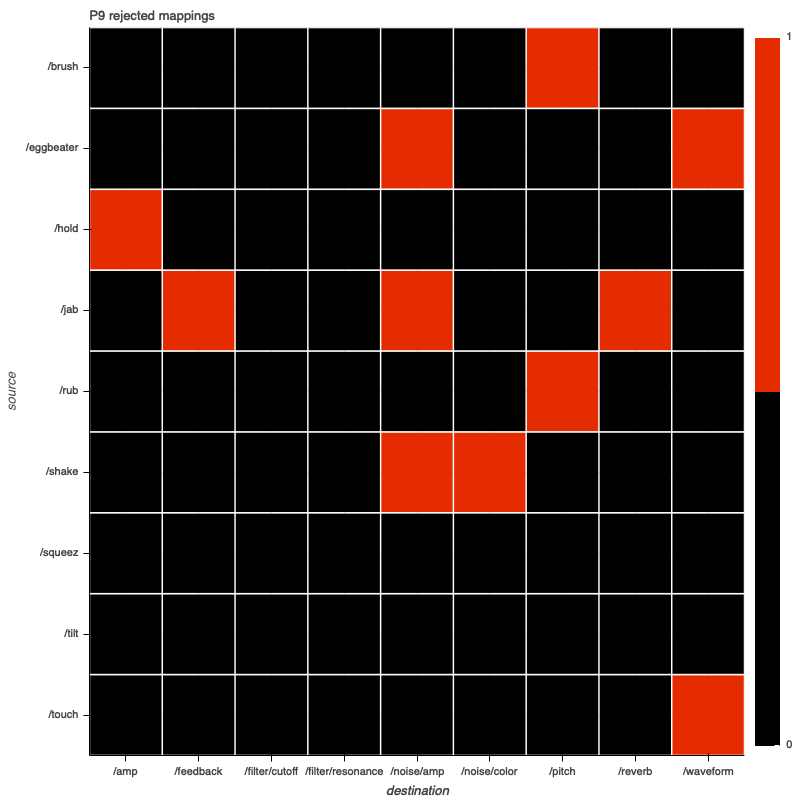
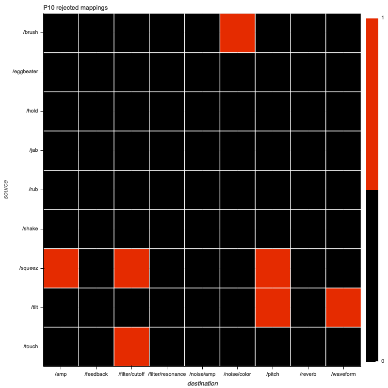
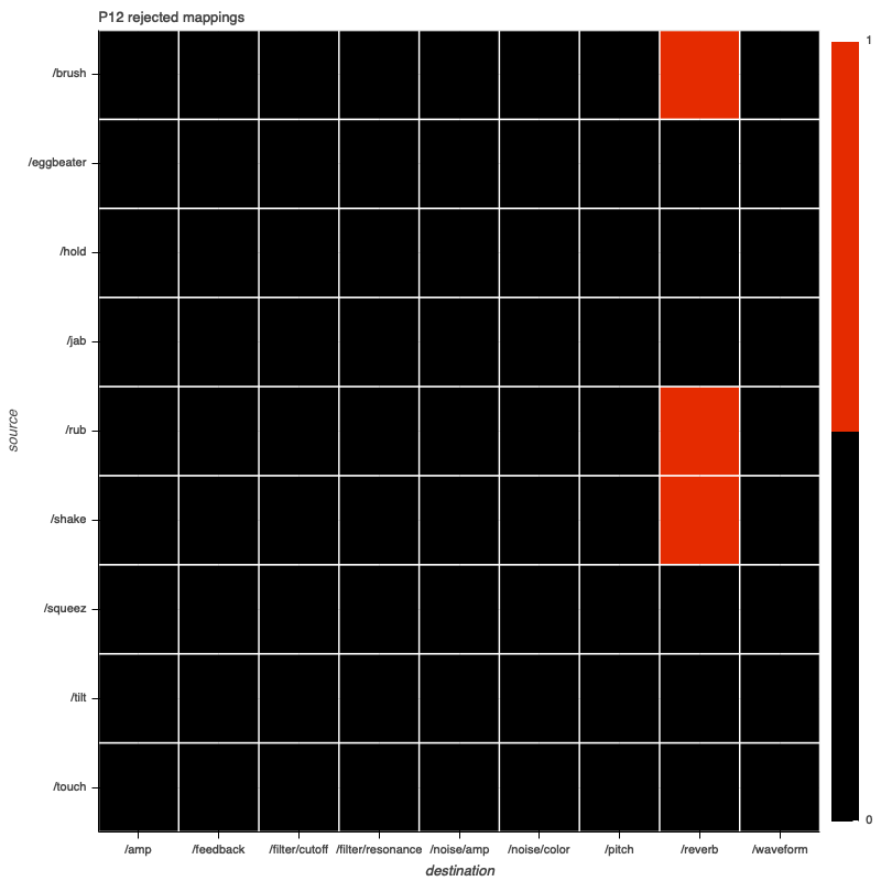
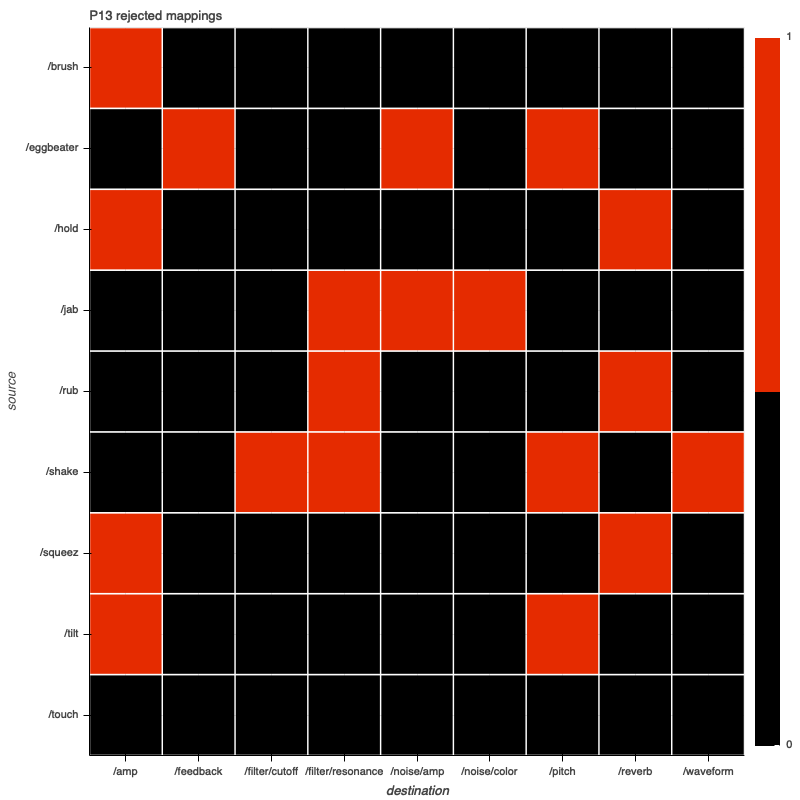
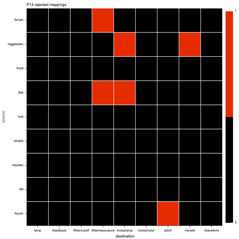
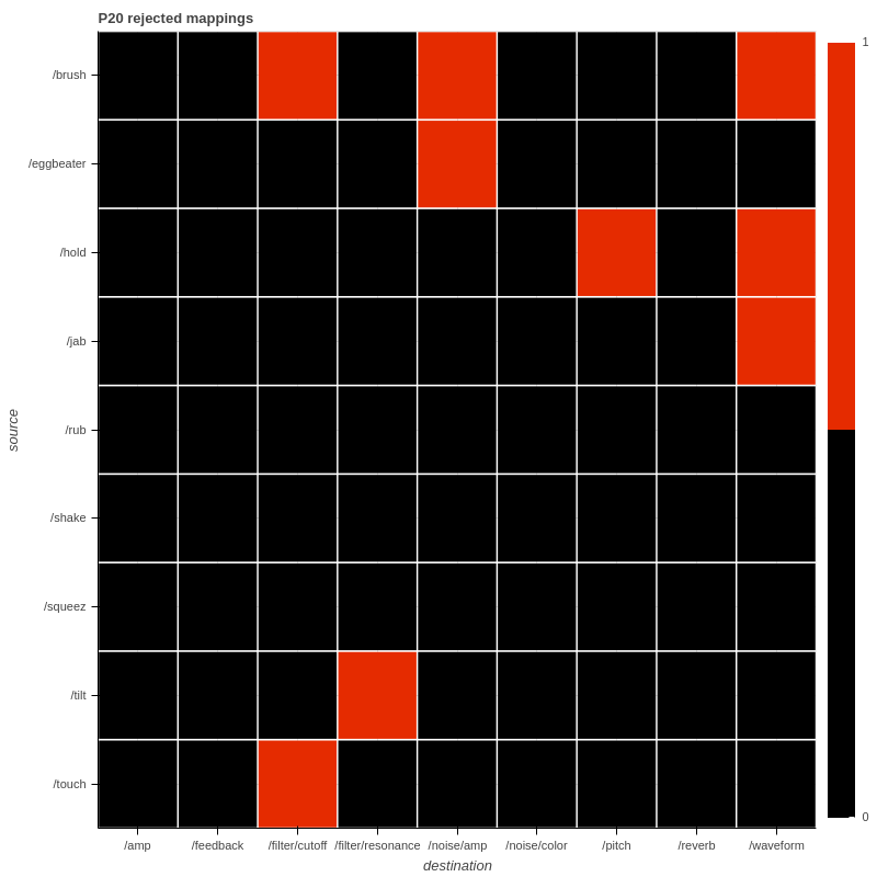
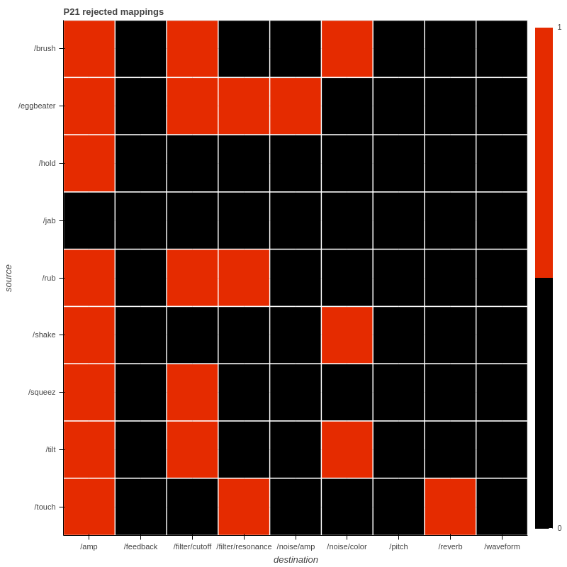
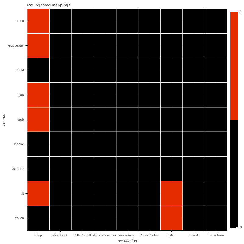
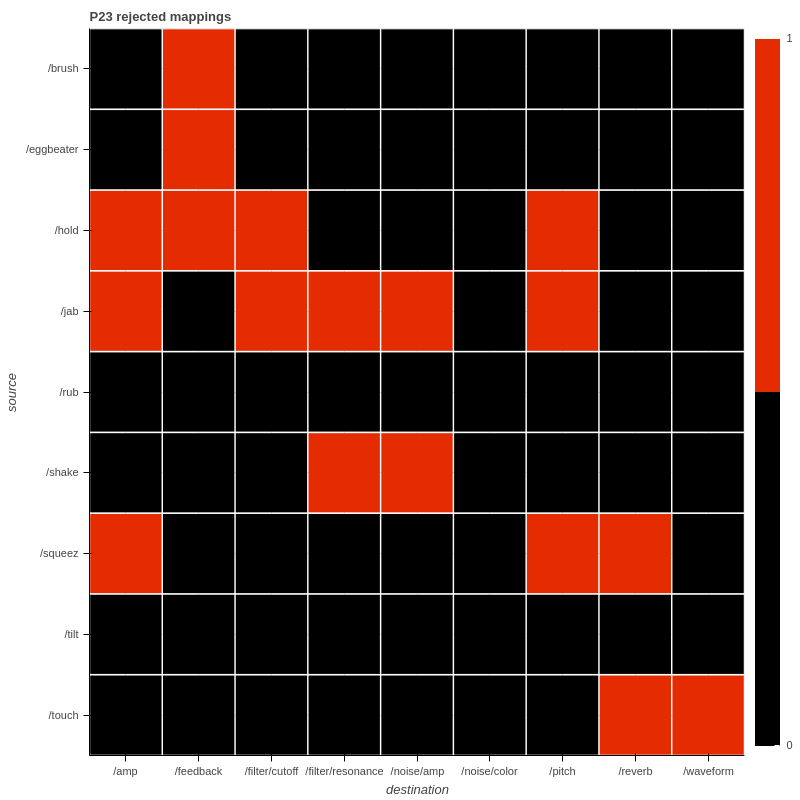
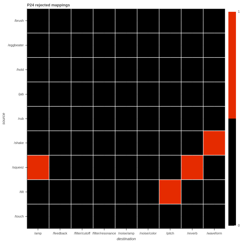
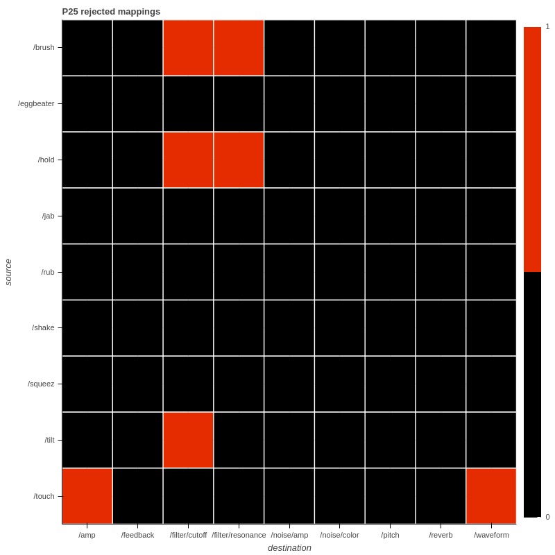
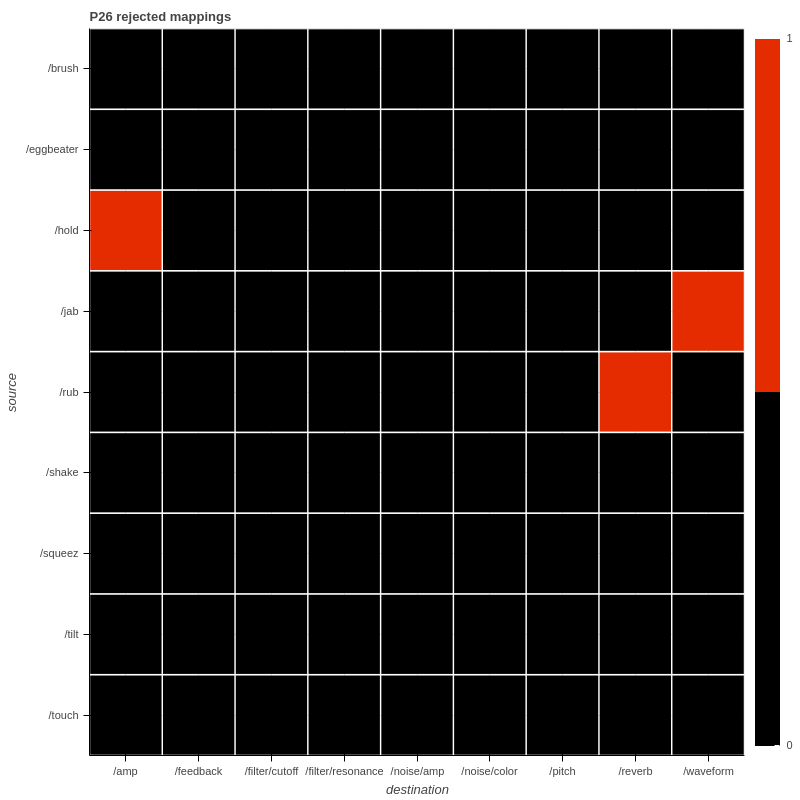
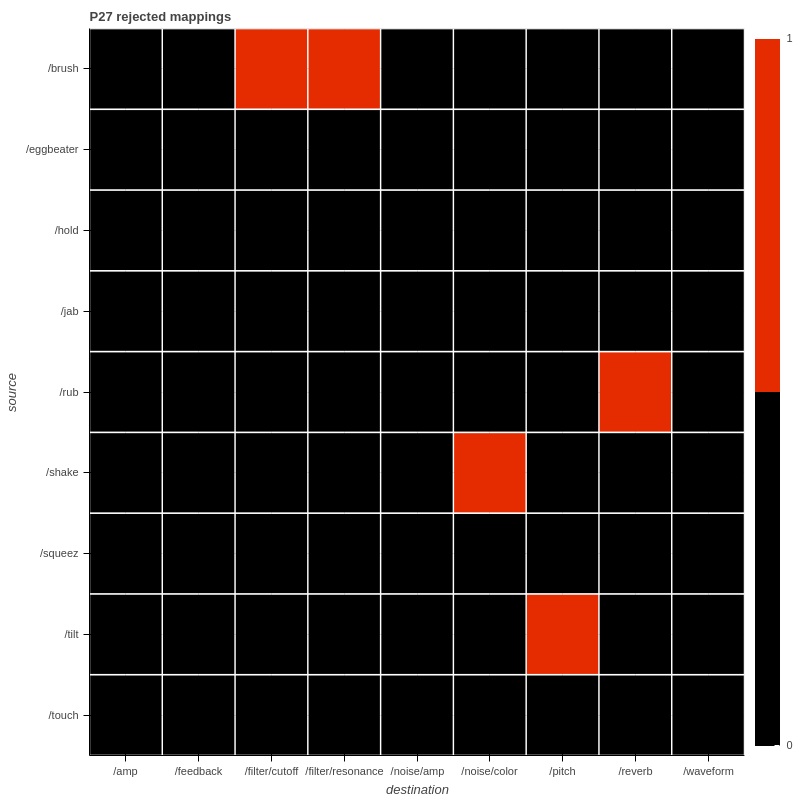
As well as the mappings, there are also charts showing the associations that participants tested during their design process but did not ultimately include in their final design. In these charts, a red cell indicates an association that was rejected by the participant.
Each individual participant's mapping can be viewed starting here, or you can jump to a particular participant using the links below:
As well as the mappings themselves, there are several charts that represent an aggregate view of all the mappings participant's designed. There are explained in more depth as they are presented below.
Participant's Mappings
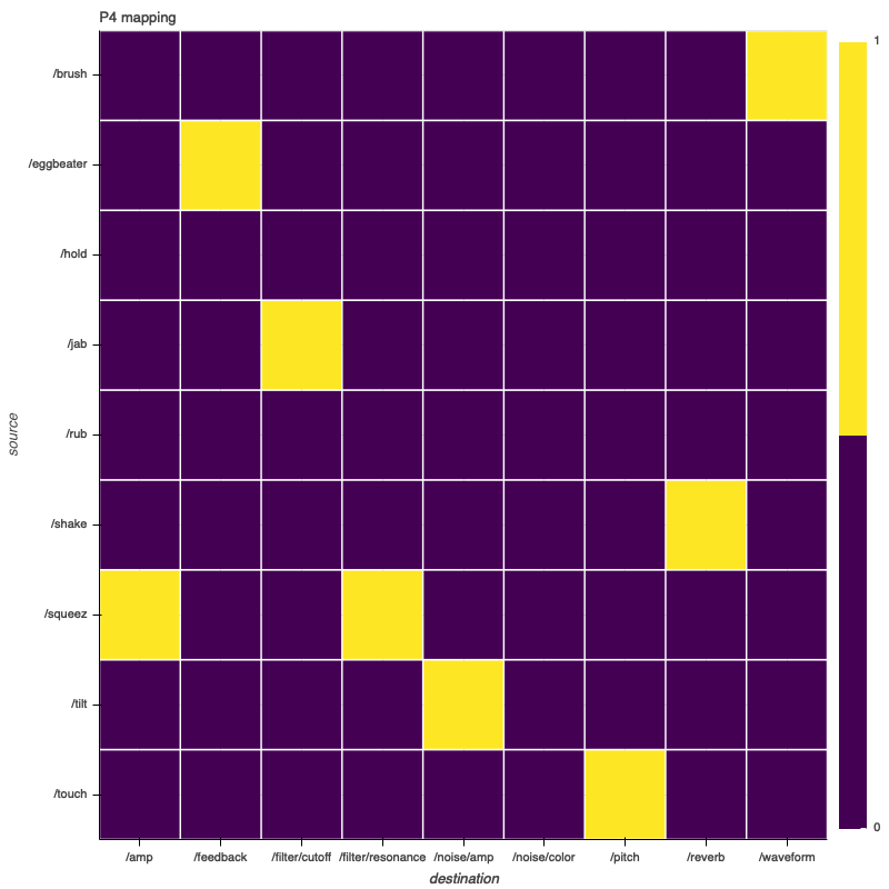
P4 rejected mappings are not available due to an error recording activity data for this participant
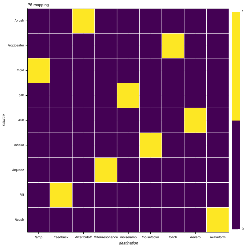
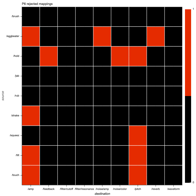
Note: P6 participated in two sessions, designing two mappings
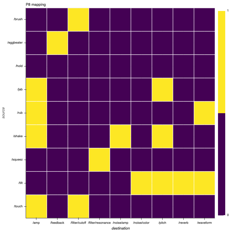
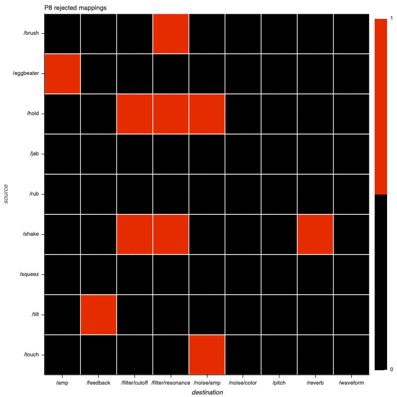
Note: P8 participated in two sessions, designing two mappings
P8 participated in two sessions, but activity data was not recorded for the second so only the second final mapping is available, not the second rejected mappings.
P11 rejected mappings are not available due to an error recording activity data for this participant
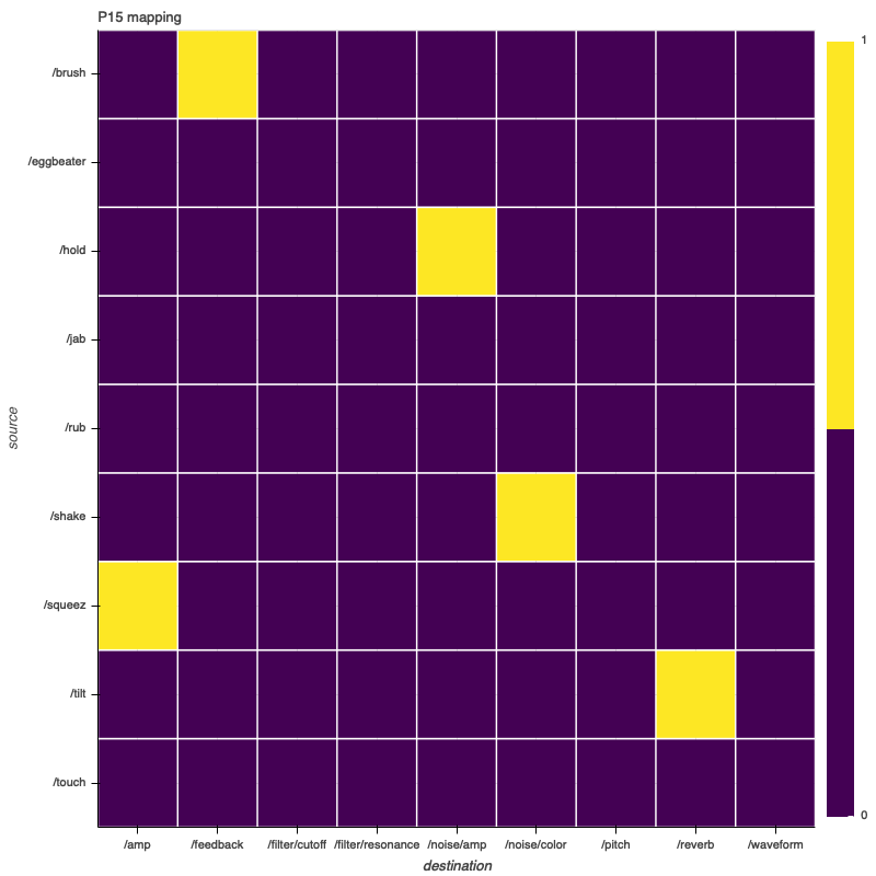
P15 rejected mappings are not available due to an error recording activity data for this participant
P27 final mapping is not available as it was accidentally not exported during the study session
Group Data
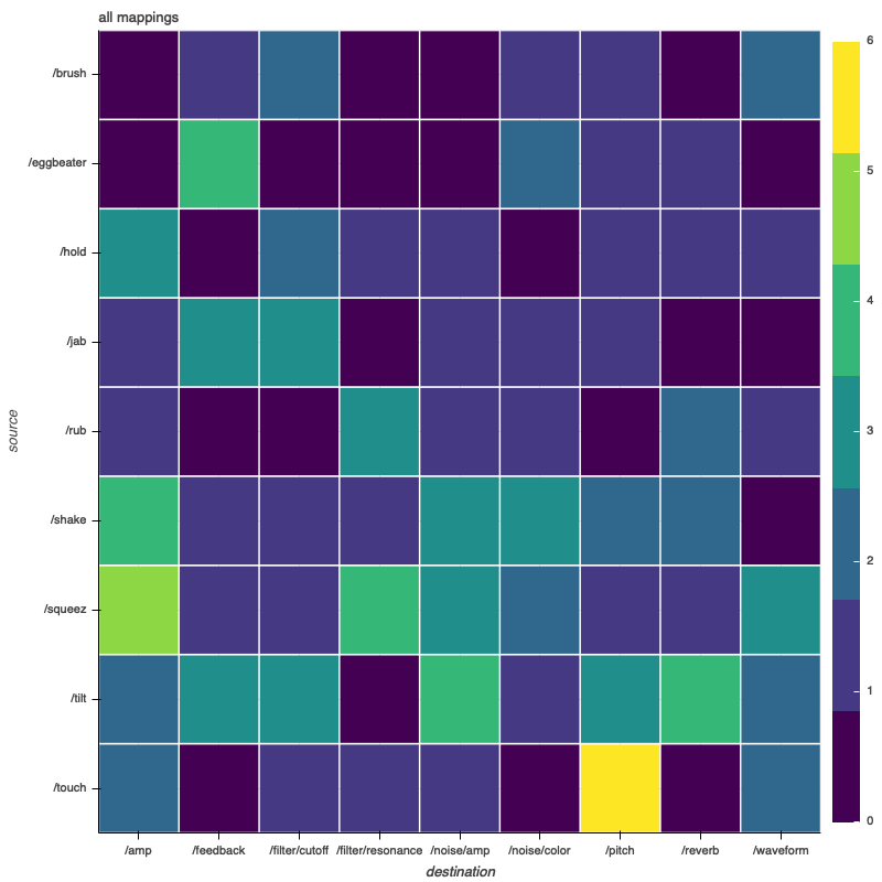
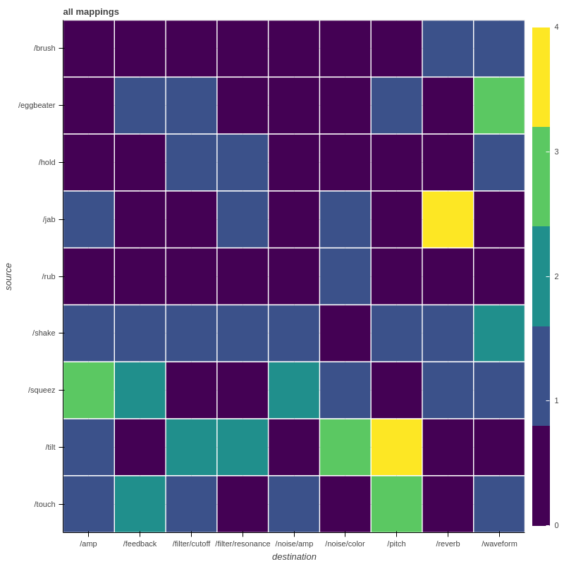
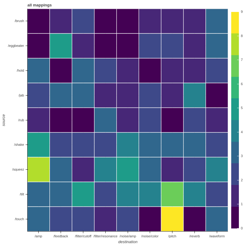
In this chart, the frequency with which a given association was utilized is visualized using a heat map. The brighter a given cell, the more times that association was used in the mappings designed by participants in the study. The first chart corresponds to group one, the second to group two, and the third to both groups combined.
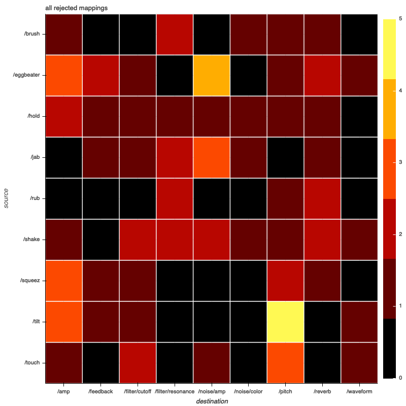
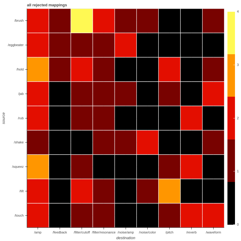
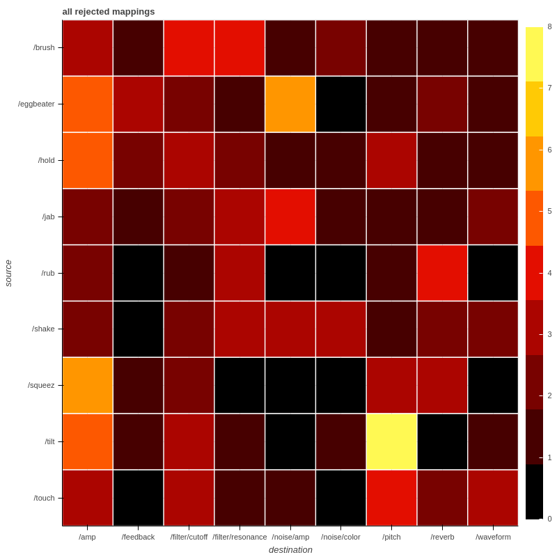
This chart visualizes the number of times each association was tested by participants but not ultimately used in their final mapping designs. The first chart corresponds to group one, the second to group two, and the third to both groups combined.
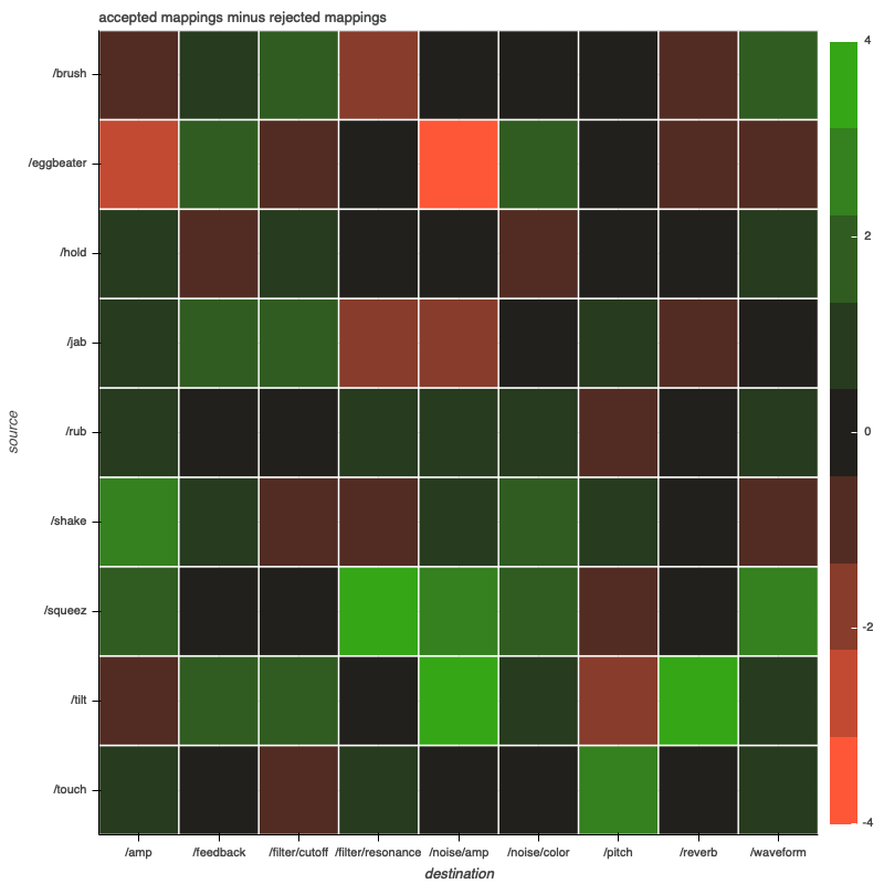
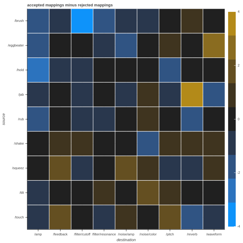
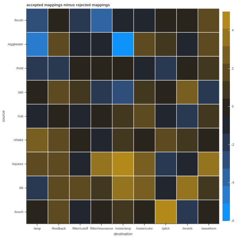
If using an association is considered as a vote in favor (+1) and rejecting it as a vote against (-1), this chart shows the sum. It could be interpreted as showing the consensus of the group overall. The first chart corresponds to group one, the second to group two, and the third to both groups combined.
There are numerous ways the mappings participants designed could be considered in aggregate to derive some kind of collaboratively-designed mapping. This chart shows one possible method: it considers the most commonly used gestures for each synthesis parameter in participants final mappings, as well as the most commonly used gestures for each parameter in the combined "vote". The resulting mapping suggests certain gestures that could be used as the primary control for each signal, with other gestures that could have a secondary influence. This chart is drawn only from group one's data.